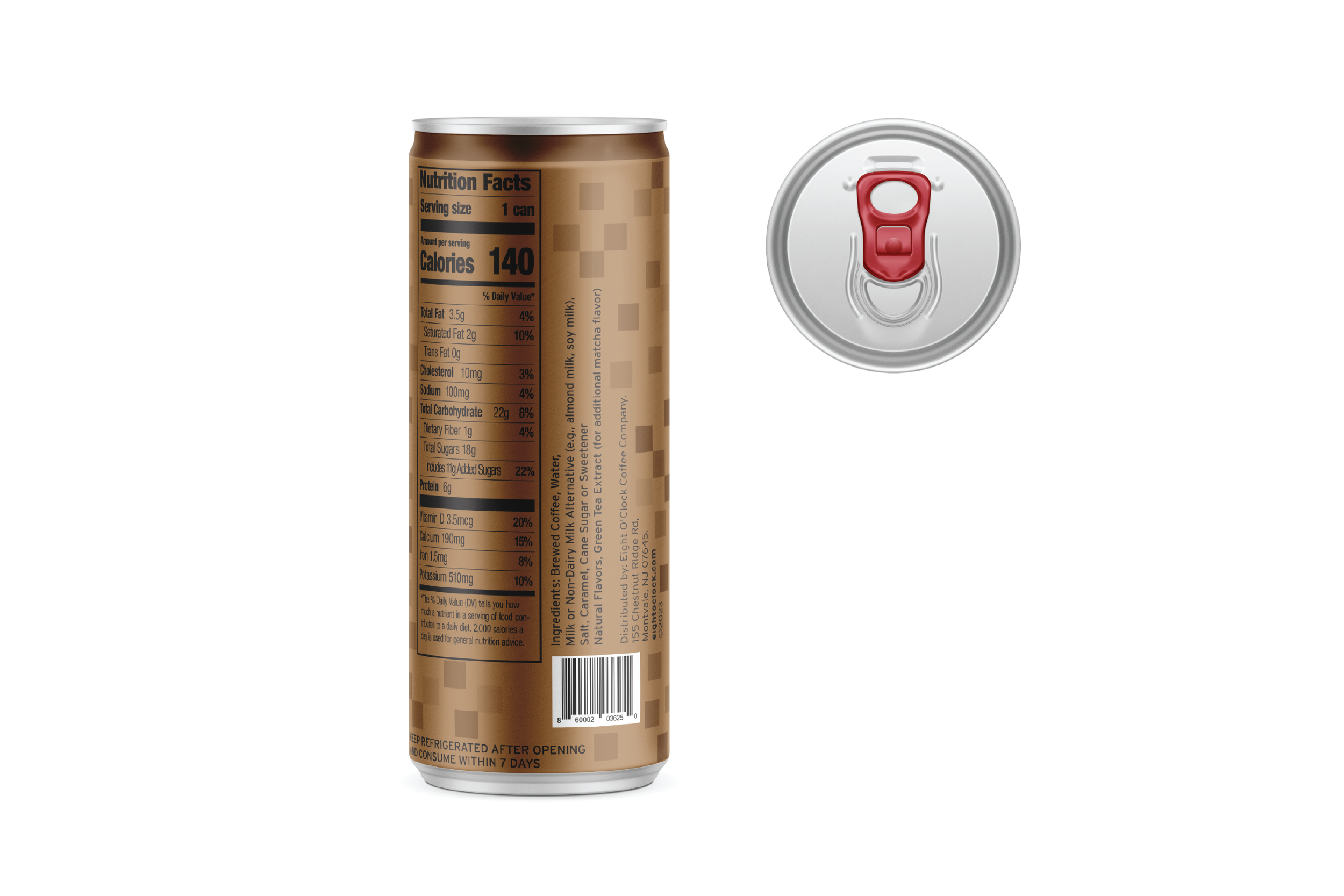
Eight O’Clock Coffee Packaging Design
Rebranding Eight O'Clock Coffee's packaging involves modernizing the design with sleek, minimalist aesthetics while highlighting its rich heritage. Use bold, clean typography and a refreshed logo. Incorporate vibrant yet warm colors to evoke a sense of tradition and quality. Emphasize sustainability with eco-friendly materials and clear, compelling product information.
Project Categories: Visual Design, Illustration, Print/layout, Branding
Tools: Illustrator, Photoshop
Salted Caramel - Front can
Salted Caramel -Back view
Matcha -Front can
Matcha - Back view


